Bubble Plot: Single Event Density within a Month
A Bubble Plot Graph for a single event density for each day within a month in the context of a chatbot is a specialized visualization that focuses on a particular event type and displays its frequency or density over the course of a month. This type of graph allows you to examine how the chosen event is distributed across individual days within a given month, providing insights into daily patterns and variations.
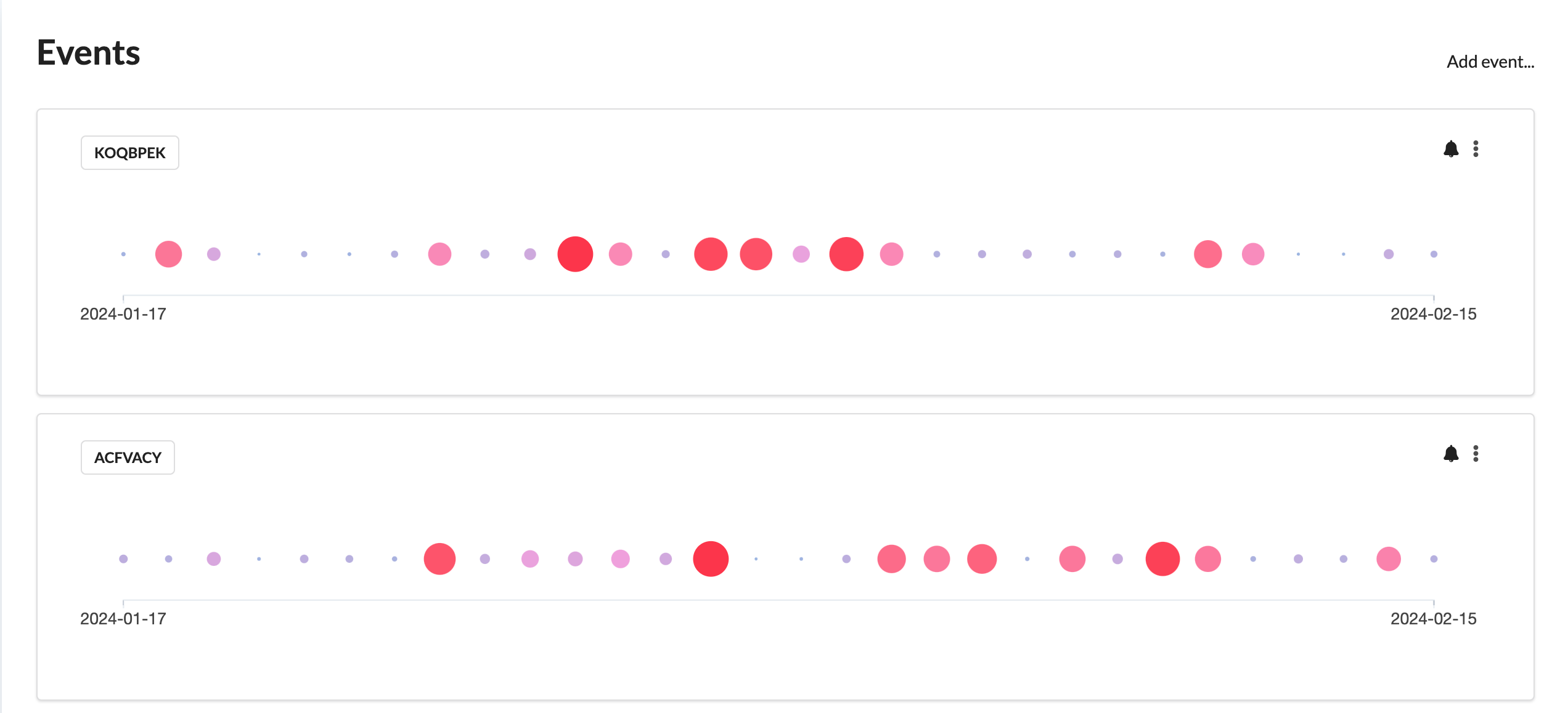
Components and Significance
Bubbles
Each bubble represents an instance of the specific event occurring within a single day of the chosen month. The size of the bubble corresponds to the event's frequency or significance on that particular day.
Bubble Size
The size of each bubble reflects a specific metric related to the event, such as the number of occurrences or the event's impact. Larger bubbles indicate days with a higher event density.
Bubble Position
Bubbles are positioned along the x-axis, representing each day within the chosen month. This arrangement allows you to see when each instance of the event occurred during the month.
Bubble Color
Colors may categorize or differentiate event characteristics, types, or attributes. Different colors can represent event subtypes or highlight specific event characteristics.
Density Visualization
The density of bubbles on each day illustrates how frequently the chosen event occurs on that specific day. Days with denser clusters of bubbles have a higher event density, while sparser areas indicate lower event occurrence.
Time Period
The graph typically covers a one-month time period, allowing observation of daily variations in event density.
Interactivity
Users may interact with individual bubbles to access detailed information about each event occurrence, such as timestamps or event attributes, depending on the visualization tool.
Insights and Analysis
Analyzing the Bubble Plot Graph for Single Event Density across the month provides insights into patterns, trends, and fluctuations in event occurrence. It helps organizations understand which days experience higher or lower event densities.
Use Cases
Event Analysis
Organizations can closely examine the distribution of a specific event type across individual days of a month, identifying patterns or trends.
Pattern Identification
Clusters or gaps in the bubbles reveal patterns or trends in event density, aiding in understanding when the event is most frequent.
Resource Allocation
Insights from the graph inform resource allocation decisions, such as scheduling human agents or chatbot maintenance during peak event days.
Performance Evaluation
Monitoring daily event densities allows organizations to assess chatbot performance and user engagement over time, facilitating improvements and optimizations.
Summary
In summary, a Bubble Plot Graph for a single event density for each day within a month for a chatbot provides a detailed view of how a particular event is distributed throughout the month. It aids in identifying daily patterns and variations, enabling data-driven decision-making and optimization of chatbot interactions.