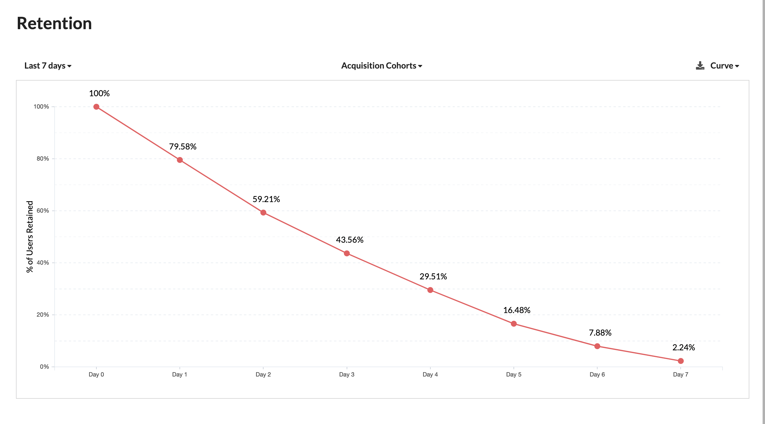
Acquisition Cohorts Curve
A "Retention by Acquisition Cohorts Curve" is a data visualization that illustrates how user retention rates evolve over time for different cohorts of users who were acquired during specific time periods. This curve provides insights into how effectively a chatbot is retaining users over the course of 7 and 30 days after their initial acquisition.

Here's an explanation of the Retention by Acquisition Cohorts Curve for both 7 and 30 days:
7-Day Retention by Acquisition Cohorts Curve
X-Axis
The x-axis represents time, specifically the number of days since users were initially acquired. It typically ranges from 0 days (the day users were acquired) to 7 days.
Y-Axis
The y-axis represents the retention rate, usually expressed as a percentage. It measures the proportion of users from a specific acquisition cohort who are still actively engaging with the chatbot after a certain number of days.
Curve
The curve on the graph illustrates how the retention rate changes over the 7-day period for different cohorts. Each point on the curve corresponds to a specific number of days since acquisition and the associated retention rate for a cohort of users.
30-Day Retention by Acquisition Cohorts Curve
X-Axis
Similar to the 7-day curve, the x-axis represents time, ranging from 0 days (the day users were acquired) to 30 days.
Y-Axis
The y-axis represents the retention rate but over a 30-day period.
Curve
The curve in the graph illustrates how the retention rate changes over the 30-day period for different acquisition cohorts. Each point on the curve corresponds to a specific number of days since acquisition and the associated retention rate for a cohort of users.
Interpreting the Curve
The curve allows you to visualize how user retention changes as time progresses after the initial acquisition. It shows whether users from different acquisition cohorts continue to engage with the chatbot or drop off.
A steep decline in the curve shortly after acquisition suggests that many users are not continuing to engage with the chatbot. Conversely, a flatter curve indicates higher retention, with more users remaining active over time.
The curve for each acquisition cohort can reveal trends and patterns. For example, you might observe that users acquired in a particular month tend to have higher long-term retention rates compared to users acquired in another month.
The 7-day curve provides insights into short-term retention, helping you understand how well you retain users in the immediate aftermath of acquisition.
The 30-day curve offers insights into longer-term retention, allowing you to assess whether users continue to engage with the chatbot over a month.
By analyzing these curves, you can identify cohorts with particularly strong or weak retention and tailor your user engagement strategies accordingly.
Monitoring these curves over time enables you to track the effectiveness of your user retention efforts and make data-driven decisions to improve user engagement.
Summary
In summary, Retention by Acquisition Cohorts Curves for 7 and 30 days in a chatbot context provide a visual representation of how user retention rates change over time for different cohorts of users. These curves help you assess the effectiveness of your chatbot's user retention strategies and make adjustments to improve user engagement and satisfaction.